‘Perfection’ – IB Art Project 3
IB Art Project 3:
‘Perfection’
11/12/2017 Mingi Webber Period 8
This is the third project related to my themes, addictions. In this case it was the addiction to being perfect. I was able to relate to this project from personal experience and while I was making it. This project wasn’t based off of just me, as it was based off of many others I do know in real life. We all want to be ‘perfect’ in someway. Even if you don’t admit it, you do want to be perfect. It’s art for me, while for others it is how media sees them. Striving to be better is good, but striving for perfection isn’t. You are always pushing yourself down, saying you aren’t good enough and you don’t want that.
PROCESS:
Creating this project made me mad, and in a way I did experience the want for ‘perfection’ while making this. I’ve never done sculpting before, nor worked with wire. It was a first time for me messing with all of these materials. I had to use someone else’s body for measurements for the body with garden wire. It wasn’t that easy for me to use it, and felt very awkward to use. Garden wire itself is hard to put together and I had no experience with this whatsoever. I kept getting frustrated with this and at one point just had to take a long break because it wasn’t perfect. While taking that break I realized that my whole project was saying that going for perfection isn’t good and it does destroy you if you keep trying to go for it. I was getting mad at myself because it wasn’t coming out as perfect and didn’t want to go on anymore. I was feeding into that addiction and I didn’t want that. I had to push myself through the project in order to get it done. I kept building the wireframe and kept saying it was OKAY it wasn’t perfect. The body itself came out close to a body. Sure there was some indentations in there, but that’s fine because no one is truly perfect, mentally and physically.
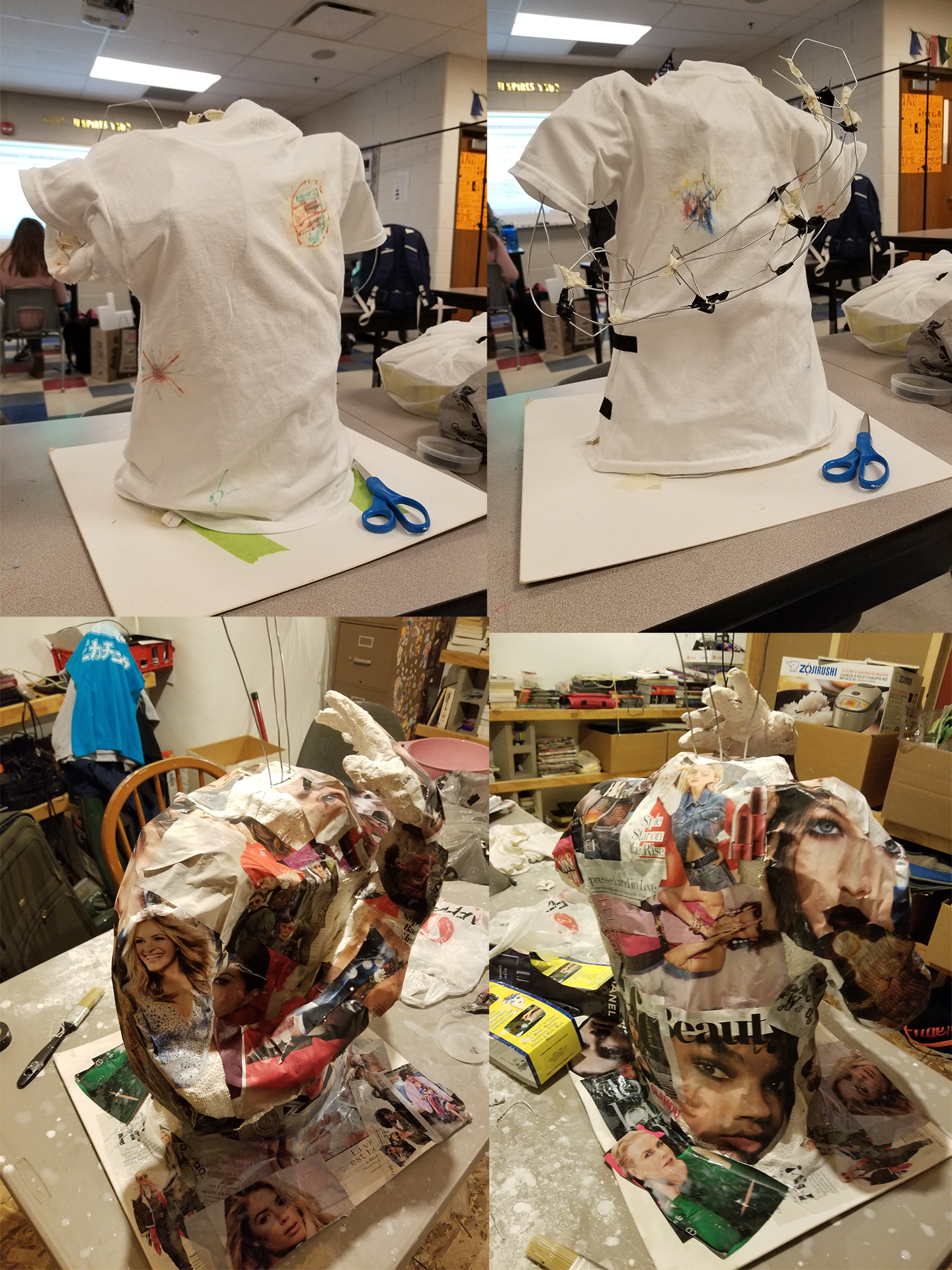
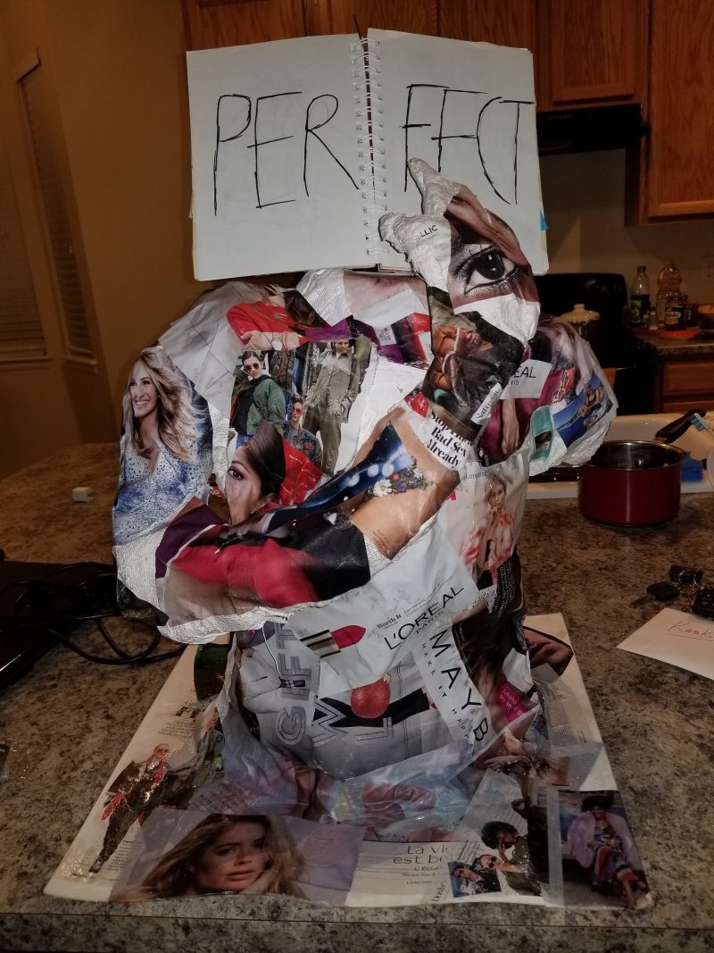
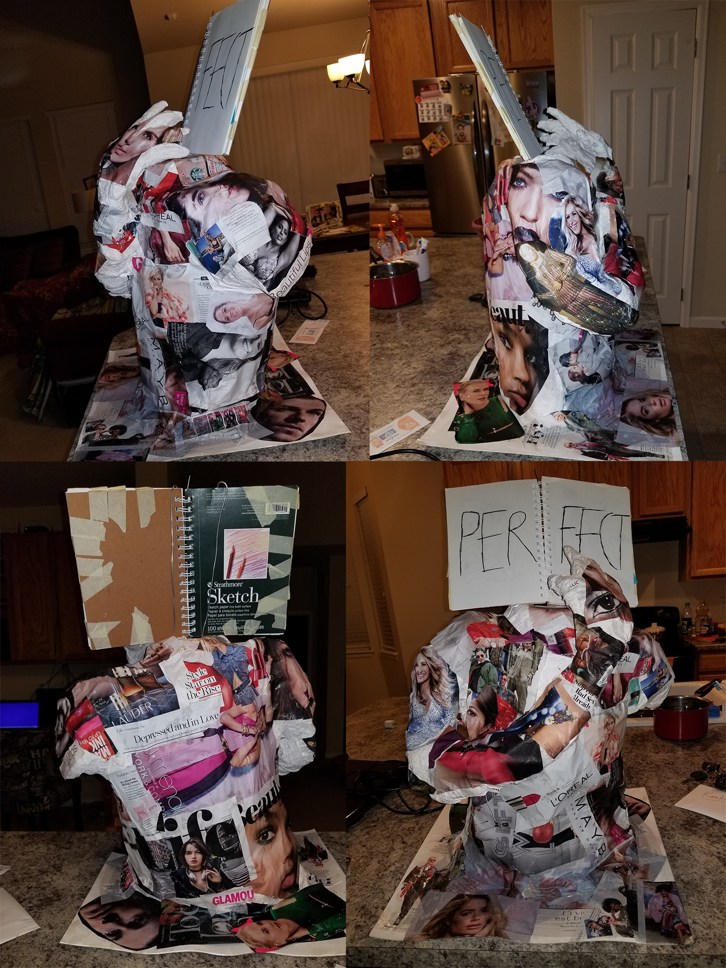
Plastering and using paper mache was much simpler for me. I ended up putting a shirt over the wireframe and it gave it a bit more structure which allowed the plaster to be put on there easily. Plaster itself is easy to work with and just involves lots of waiting because it needs to dry. It’s the same for paper mache. For the paper I ended up using glamour magazine, a glamorous life. All of the people in those magazines are shown to be perfect. They have the ‘right’ facial shape, body height, skin, etc. There is no blemish to them. Many look up to these models and attempt to look like them, which most of the times it isn’t possible to look like these models as they are photo edited. People try so hard to look like them and end up having this ‘beauty’ eat them up. It starts taking them over slowly, in bits and pieces. They become so addicted to perfection that they lose themselves in the process.
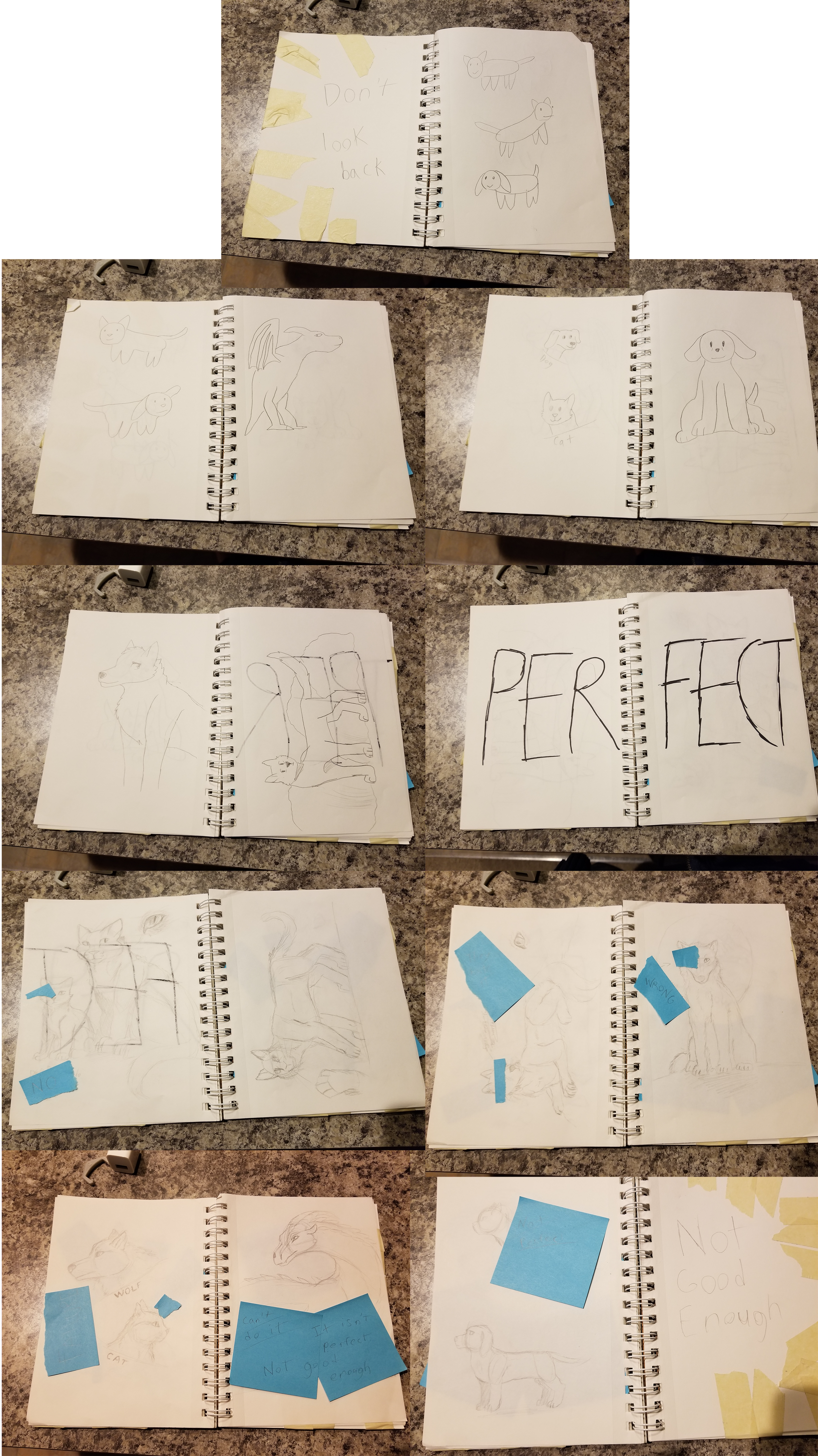
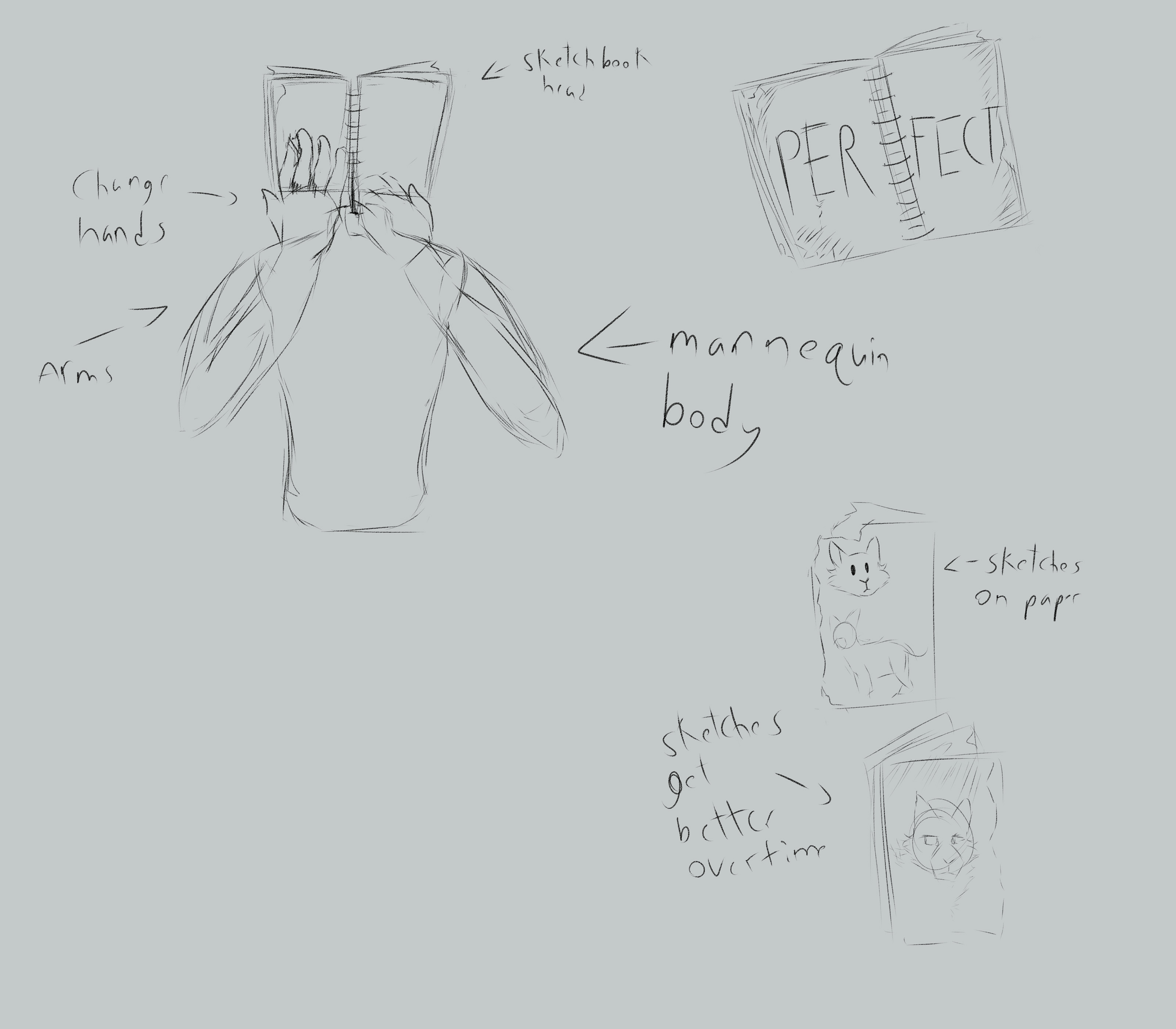
The sketchbook head has the word ‘PERFECT’ scratched onto it. The pages around can be flipped to the right or left direction. All of the drawings in the sketchbook were sketched in a standard number 2 pencil. The ones towards the left have more of a child-like quality to them. They mostly have single stroke lines that are confidently done. These doodles show that the child didn’t care for perfection at first, and they just had fun with drawing, then perfection hit them. After the ‘PERFECT’ that is in the middle of the sketchbook, you can get a slight peek at the sketches, but not much. The hand it held up in front of that side, covering it up. If you do look in the sketchbook, you are able to see VERY rough sketches of animals. This shows the child has been hit with ‘perfection’. They aren’t as confident anymore. They want everything to be perfect. If they can’t draw something right they are going to cover it up with sticky notes so they don’t show any mistakes. Any sort of reaction or critique towards their sketches is covered up. Their insecurities of not being perfect prevents them from showing off their work to the world and improving on their artwork.
INSPIRATIONS:
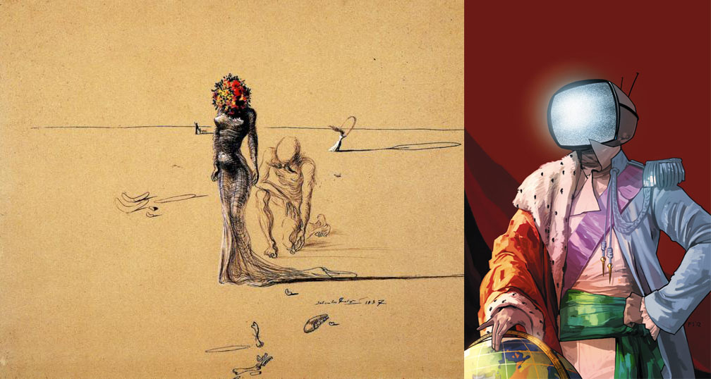
There was a few people I was inspired by, but it was mainly from design wise for the mannequin. From the pictures, you can see that the person is an object head (someone with an object for a head (ex, TV, toaster, book, etc)). Salvador Dali had some flower head figures in his painting. ‘Woman with flower head’, 1937, is one example that shows this. There is a woman figure, but instead of having a normal head she has a bouquet of flowers. An another inspiration I had was from Fiona Staples who is the main artist of Saga. Within that story they have many interesting character designs but there are some characters really grab my attention. Prince Robot IV really catches my attention because of his monitor head and he always has the head changing to show off his emotions or thoughts. In mainly took inspiration from the design because I didn’t want a normal person head on there, I wanted an object on the head. It makes it much more interesting and others can relate to it more (as the sketchbook head could relate to an artist struggle).
CONCEPT ART:
I did one piece that was concept art to see where I was going to go with this project. I needed to create a sketch before hand or else I felt lost and didn’t really know where I was going with this project. I ended up using Paint Tool SAI 2 because it allows me to sketch quickly on there. With the concept sketch you can see this project was originally going to have two arms, not one. I wanted to have an arm ripped off the final project because it did show that the figure was being ripped apart by their addiction of being perfect. Also in the original sketch there wasn’t any signs of the glamour magazine being on the figure. It was just going to stay as gray, and just have artist relate to this but I felt as if there was a lot of wasted space on there and could use the body for something, then realized many people want to have their bodies look perfect. I thought about it more and then recalled media does exist and it shoves in everyone’s face that you need to be PERFECT. The body was a perfect spot to put glamour magazines on. Their body is slowly being eaten away from media and their true self is being covered up.
STRUGGLES:
This project was out of my comfort zone. As stated before, I NEVER worked with sculpting, so this was a large step for me. I struggled with the wire and got frustrated with it many times. If anything, my major thing I wished I improved on was having a bit of knowledge with sculpting before jumping straight into it. I was worried I was going to run out of time, but luckily didn’t and made it before the deadline. Staying motivated for this project was also a struggle because I did get mad at myself it was not perfect. I did learn that it’s okay for it to not be perfect, and that was the point of the project. Perfection isn’t always something you should go for, you should always go for improvement. Once I realized that, it made it easier to work on the project and realized my mistakes were fine because I was doing this for the first time. Getting mad at myself for it not being perfect was pointless and slowed me down. I really did learn a lot from my struggles from this project.
Reflection:
Overall I did get good reviews for my project. People were very interested in the idea of perfection. You never really think of it as an addiction that overtakes you. Others did say that I could’ve made the model look more ugly, which I do agree with. People are ugly and not completely perfect. I need to push it more. That was one of the same things with the sketchbook head. The word ‘PERFECT’ needed to be more scratchy and messy. Again it’s the whole thing where I needed to push it more. The main feedback I did get back was to push it more and make it look more ugly on purpose. Many were very impressed I did something completely out of my comfort zone and did something that wasn’t digital art related. I was being a risk-taker with this project, and will most likely be doing it again in the future.
Leave a Reply