‘Just One More Please’ – IB Art 2
IB Art Project 2:
‘Just one more please!’
10/9/2017 Mingi Webber Period 8
My project was related to beginnings and my own personal theme, addictions. In fact, I relate to this whole project, as it was based around my younger brother. He has a rather serious addiction to gum. It’s fine to like gum, but he craves it to no end. My brother always chews gum and has all of these nasty old wrappers sitting around everywhere. It’s quite disgusting if you ask me. My family denies his gum addiction too, claiming he is perfectly fine and has no addiction. This shows that most of his loved ones see no flaws in him and thinks he is ‘perfect’ and has ‘no issues’.
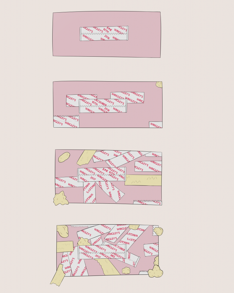
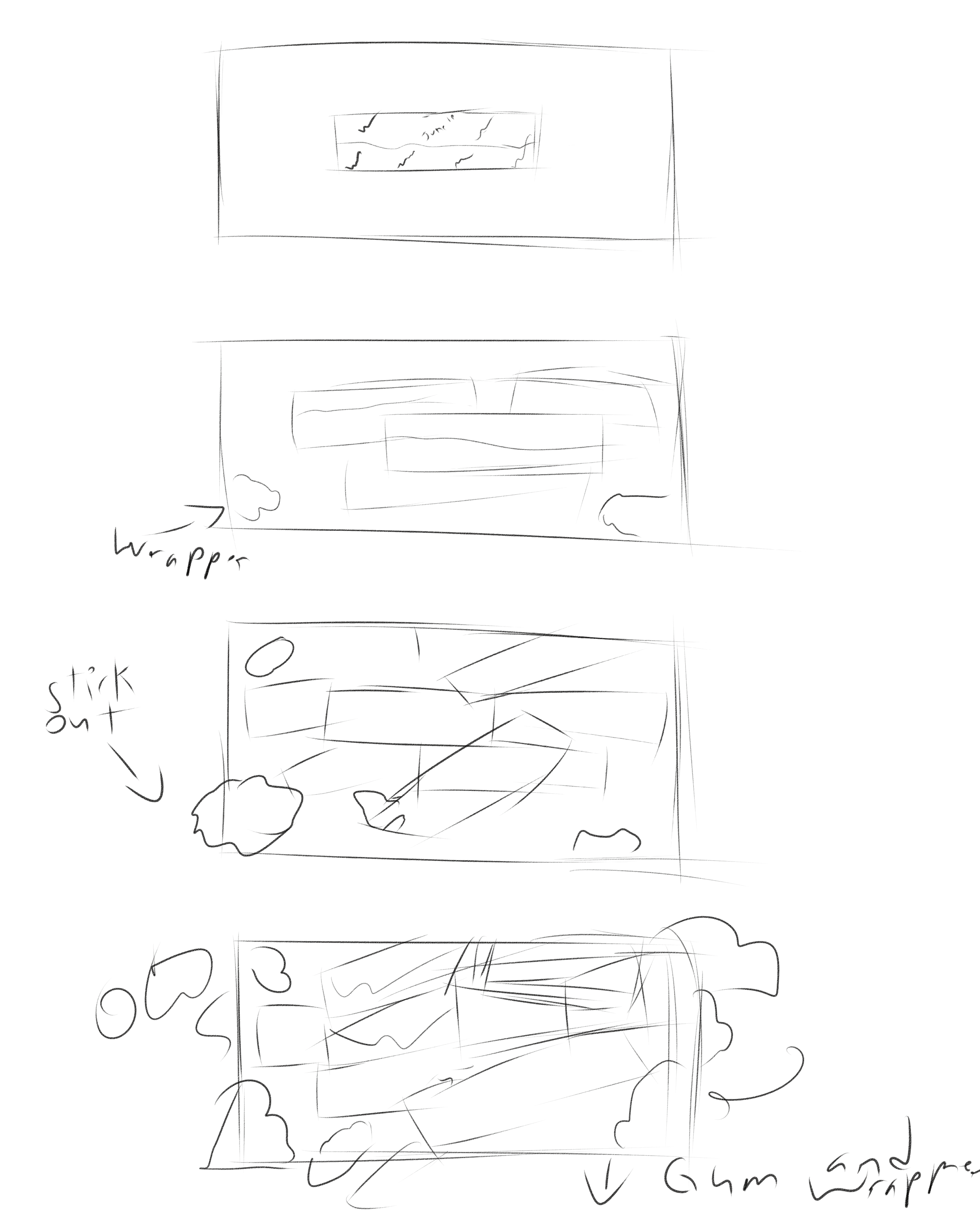
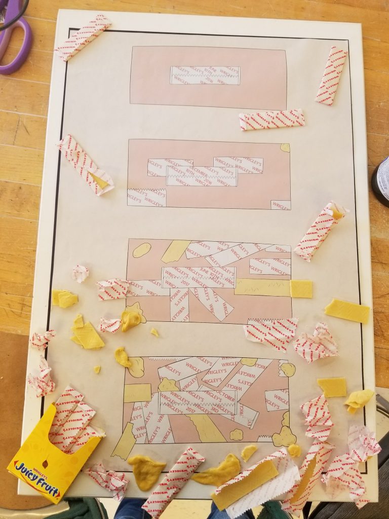
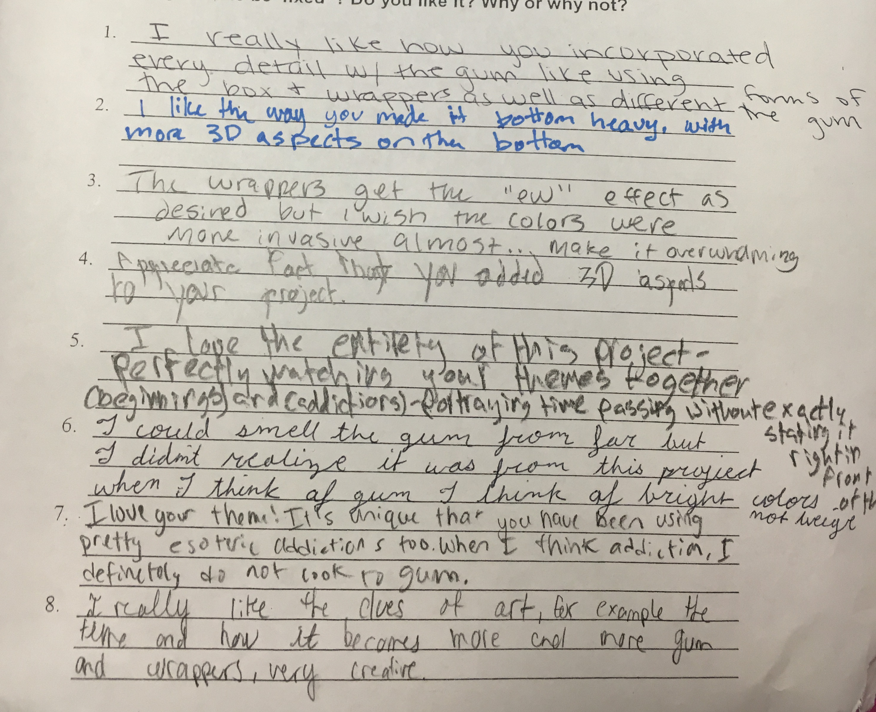
To show my brother’s gum addiction, I did a ‘timelapse’ of it. In other words I showed the start of his addiction (June 10, 2016) until now. It started off as a normal piece of gum. Just a single piece of gum and no one really cares about it. Then his addiction slowly starts to grow. December 10, 2016 his addiction grows a bit more. It isn’t anything super serious yet. Just a few more pieces of gum, nothing much and he kept asking for one more piece, which my mother was fine with giving him another piece. Then it goes to June 10, 2017. I would consider his addiction to be noticable now. He was chewing almost a pack a day and left his wrappers, random pieces of unchewed gum, and chewed gum. Now, it’s overwhelming. All he does is chew gum with whatever activity he is doing. That means he leaves more of a mess, and it’s just nasty overall. This makes me concerned for him, as he is slowly destroying his physical health because of his addiction, yet he doesn’t see it. He keeps chewing more and more gum. He isn’t planning to stop soon, and keeps asking for more gum.
There was many things that inspired me to make this project. Next to my brother’s gum addiction, I was inspired by Andy Warhol’s pop art. While it might be hard to see the connection between my art and his art, there is a slight connection. I didn’t change the middle gum next to the ‘Wrigley’s’ text and the date. Other than that, the gum did stay the same the whole time. I did not follow the change in colors, but I did keep one part of it the same, and that was the main piece of gum. More gum and wrappers were added around the gum, showing there was a time difference between each panel. Overall, the main piece did stay the same with changes. Andy Warhol’s art features the colors being changed, but everything else stays the same.
I used digital art for the medium and got the paper printed from FedEX on a 16 in width by 20 inch height normal paper with standard colored ink. I came across a few issues with the paper, mainly relating to water. The paper did get slight water damage onto it, which messed up some of the ink and made some areas of it lighter. This was fixed once I was able to cut some of the paper and was able to put gum on it (as the main water damage was towards the bottom). Next time I might attempt to use thicker paper so water damage would be much harder to appear on it. There was darker construction paper under the main piece, allowing there to be some support for the paper. The white frame was to make the Wrigley’s gum pop up more. It allowed it to be more noticeable and matched colors. The art program I used was Paint Tool SAI2, as it allowed me to make the panels and allowed for the Wrigley’s text. One issue I did have with the project was it felt somewhat dull putting the text over and over onto each gum wrapper. It was repetitive, and I felt the process for that could’ve been done faster. Possibly photoshop could’ve been used and I could use the brush making features on there to create a text brush with ‘Wrigley’s’ on the wrappers. I also used about two packs of Wrighty’s Juicy Fruit gum because this was the gum my brother chewed the most. It relates to my brother’s addiction because that’s the main (and possibly only) gum he likes to chew. Wrappers are also everywhere too, allowing for a dirty and ‘messy’ look because his addiction is disgusting and there is a mess everywhere because of his addiction.
If I did struggle with anything in this project, it would be time. Over the two weeks I had to work on this project I was very ill and had limited energy. I tried to put all my effort into this project, and still made it on time, but it was a bit close for my liking. I could set more of a schedule to try to prevent this, or some sort of back up plan if I am sick.
REFLECTION –
Overall I got positive reviews on my project. The one main thing people were having a debate over was the colors I used for my background. The two colors were beige and light pink. It was mostly against the beige. Some were saying they didn’t like how the background was lacking a primary color. While others were saying they did like the lack of color and it gave it more of an unsettling feel. Gum is suppose to be bright and have happy colors! It normally shouldn’t be dull and give you a creepy feeling. I was fine with how I had my colors and would most likely keep it. It was suppose to have dull colors so the gum wrappers pops out more. If I could of done anything, I would of most likely added a color gradient. I could’ve had it be brighter/more saturated colors towards the top, showing the gum addiction started off as innocent or happy, then it could’ve became more dull showing the more messed up sides to it. Also with the gradient I could of had the attention be more spread out. Most of the attention is towards the bottom because of the gum wrappers that pop out. Other than that, people liked that I had the wrappers and gum towards the bottom of it, making it pop out. I think I may do that more in my other pieces of art for the future.
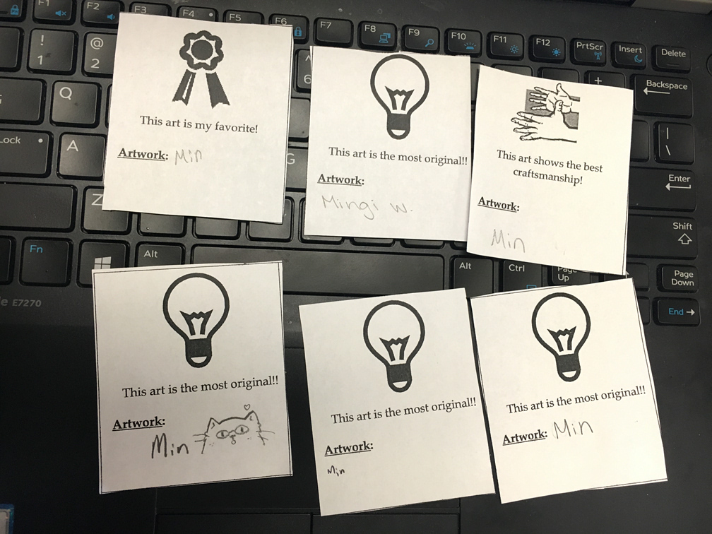
With presenting we also got some review. A majority of mine was related to being original. In someway, I was disappointed that there wasn’t any ‘yuk’. I wanted people to say the gum was gross, but I suppose many people thought the yuk was ‘I didn’t like this art’. I understand why many thought my project was original because no one really works with chewing up gum. The concept was most likely the part where it made them think it was original. No one thinks of gum for an addiction. When you think of addictions you think of smoking or drugs, not some gum. I was expecting to see these results overall.
Leave a Reply